I searched on google for thriller fonts and this is what i found out, they are all very similar, usually capitals or the first and last letters are bigger then those in the middle, this is clearly a convention of the font of thrillers. Looking at various other examples of thrillers title sequences, I can see that the colours are generally dark, ie black, blue, red, usually a connotation of the theme or genre. However white is usually used with black, for example black background with white text or vise versa. Examples of this would be 'Inception' 'Catch me if you can' and 'Phone booth'.
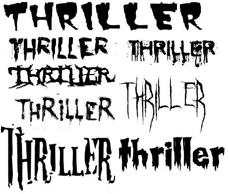
I researched different kinds of thriller fonts online and found a bunch of them, i put them all together on one image to look at them as a whole and compare, and looking at them its clear why they are used, they are mostly bigger on the first and last letters, also capitals are used alot of the time, aswell as the ends of the letters being exaggerated. Some of the fonts have an almost scratched look about them, making it look scary, also some fonts have things like blood dripping from the bottom of the letters.
No comments:
Post a Comment