Red
Black
and then green/dark colours ( to create a night vision effect )
We researched the colours to see connotations and what kind of effect they would create on the audience, we found that RED generally can be seen as love/lust but also blood and danger, which we need to make the audience feel tense. BLACK can show a number of things such as intellegence, smart, punctuality, buisness etc, but in thriller cases it shows darkness, evil, mystery. WHITE shows purity and sometimes peace, but it can also be seen as a religious sense, and in some countries can be worn at funerals, it also is known as being ''scary'' due to things like spirits and ghosts.
By using these colours we are conforming to the conventions of a typical thriller, where most colours used in the title sequences are red, black, blues, white.
We have used things like white noise, which is obviously white so we have needed to add dark coloured text on top to make it contrast so that it stands out. Which is why we have used black text. We were considering using white/red text on top of the actual video footage but felt that it may distract the audience from the opening scene which we want them to focus on, so therefore we decided to add white noise as part of the title sequence so that we could display text on that.
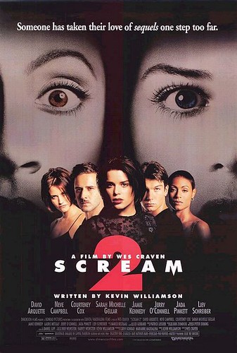
Example of scream, showing typical thriller colours
No comments:
Post a Comment